Arla Ko
Reclaiming the cultural status of milk through one of Sweden’s most iconic brand assets
Packaging
- #1Awarded strongest brand in Swedish grocery sector 2025 - 4th year in a row.
- 96,4%Brand penetration in 2025
How could we help Arla KO reclaim the cultural status of one of it’s most ubiquitous, yet valuable products - milk. And future-proof it’s position in an increasingly commoditised dairy category?
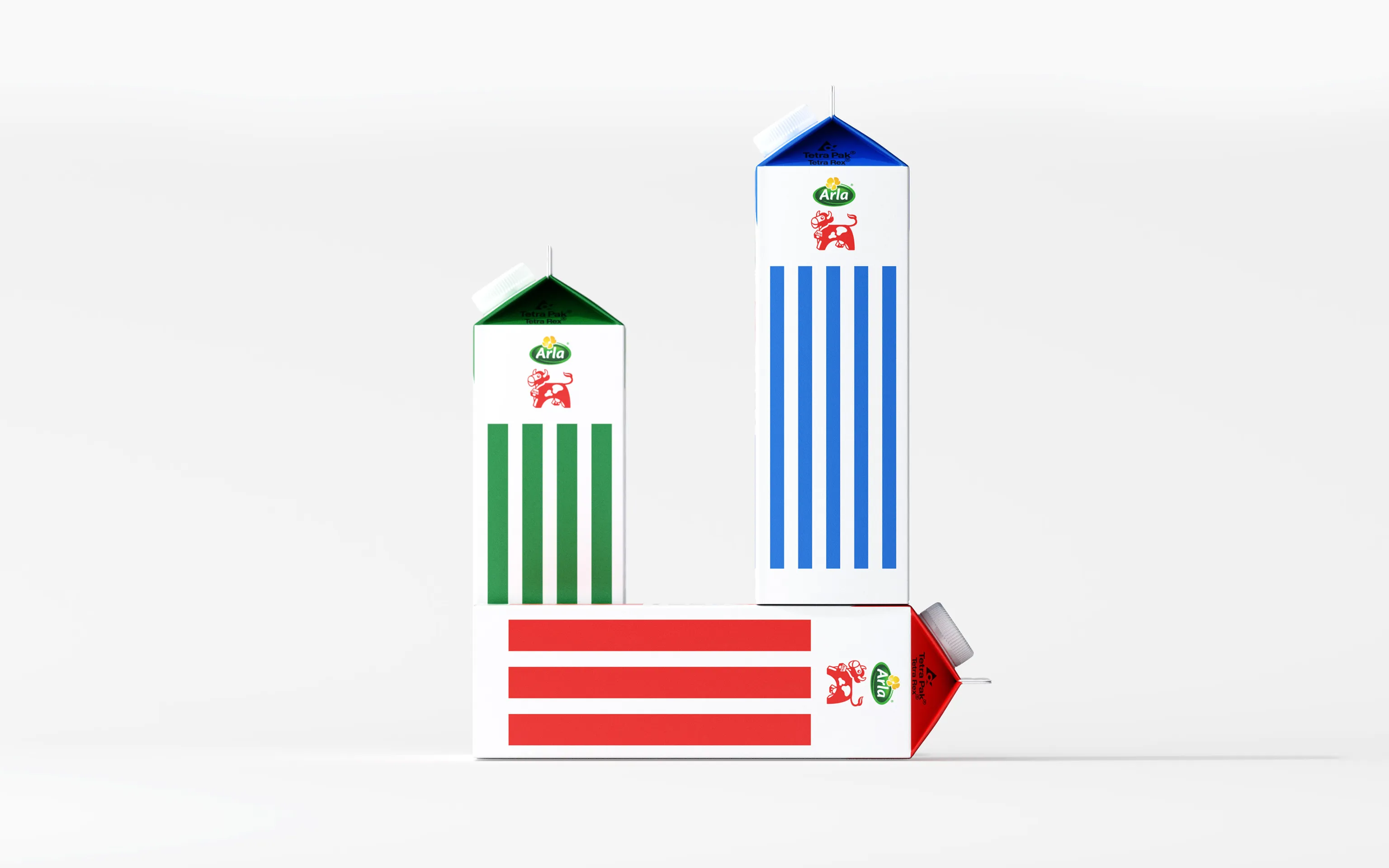
Analysis cluttered. Diagnosis strip. Arla KO’s famed clean, bold stripe system had fallen victim to the cruelties of time. Gradually diluted by an increasing array of details, claims, and competing messages, it’s capacity to impact had all but vanished. By stripping back the layers of historical clutter we resurrected the iconic stripes, gave them an entire panel, and empowered them to build unmistakable brand recognition. Due to the way milk cartons are stacked on trolleys, this panel naturally becomes the front-facing side in-store, creating a striking visual block when placed together - something no private label can replicate.
What we did
Packaging design system - We redesigned the packaging system by stripping away visual clutter and restoring focus to Arla Ko’s most distinctive brand asset: the stripes, originally designed by Swedish Tom Hedqvist in 1992. The system was developed to work seamlessly across the full milk range, including all three fat levels, while maintaining clear hierarchy and instant recognition.


