Champis
From dusty nostalgia to a bubbly classic.
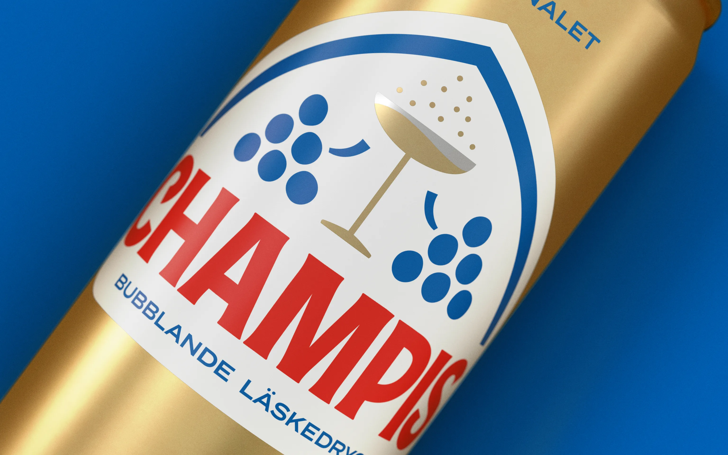
Packaging
How could Champis evolve from a slumbering classic into a brand that’s both iconic and relevant, without losing its unmistakable heritage?
We searched the Champis archives and found a century’s worth of design heritage and historic branding. This inspired a renewed visual identity, with every detail shaped by its rich past and inspired by the golden era of soft drinks in the 1950s. With a refined emblem and lighthearted ’Take a Champis, buddy’ tone of voice, we brought back the bold yet bubbly nature of the brand to spark fresh connections.
What we did
Logo refresh – For many sodas, the logo is the pack. For Champis, the task was to preserve its strong heritage while removing visual clutter to create a fresher, more energised expression. By letting go of the castle and giving space to the grapes and the iconic bubbly glass, we clarified the brand’s character and strengthened its recognisability.
Packaging system – Starting from a zero-base approach, we redesigned the entire range across all packaging formats, including secondary packaging. The system brings consistency, vibrancy, and scalability. ensuring the renewed identity travels seamlessly from bottle to multipack, and from shelf to celebration.


