Göteborgskex
Dusting off the cookie aisle with iconic cookie heroes under one strong umbrella brand.
Strategy, Brand System, Packaging
- +50%SoM - Strengthening a leading brand in biscuits
- 13We united a broad portfolio of cookie heros under 1 clear umbrella brand
As private labels grew by imitating Swedish cookie classics, the category became crowded, dustier, and less engaging. With declining trust in taste and ingredients, Göteborgs Kex needed to reclaim confidence and clarity - standing out not by shouting louder, but by asserting its originality and pride in quality.
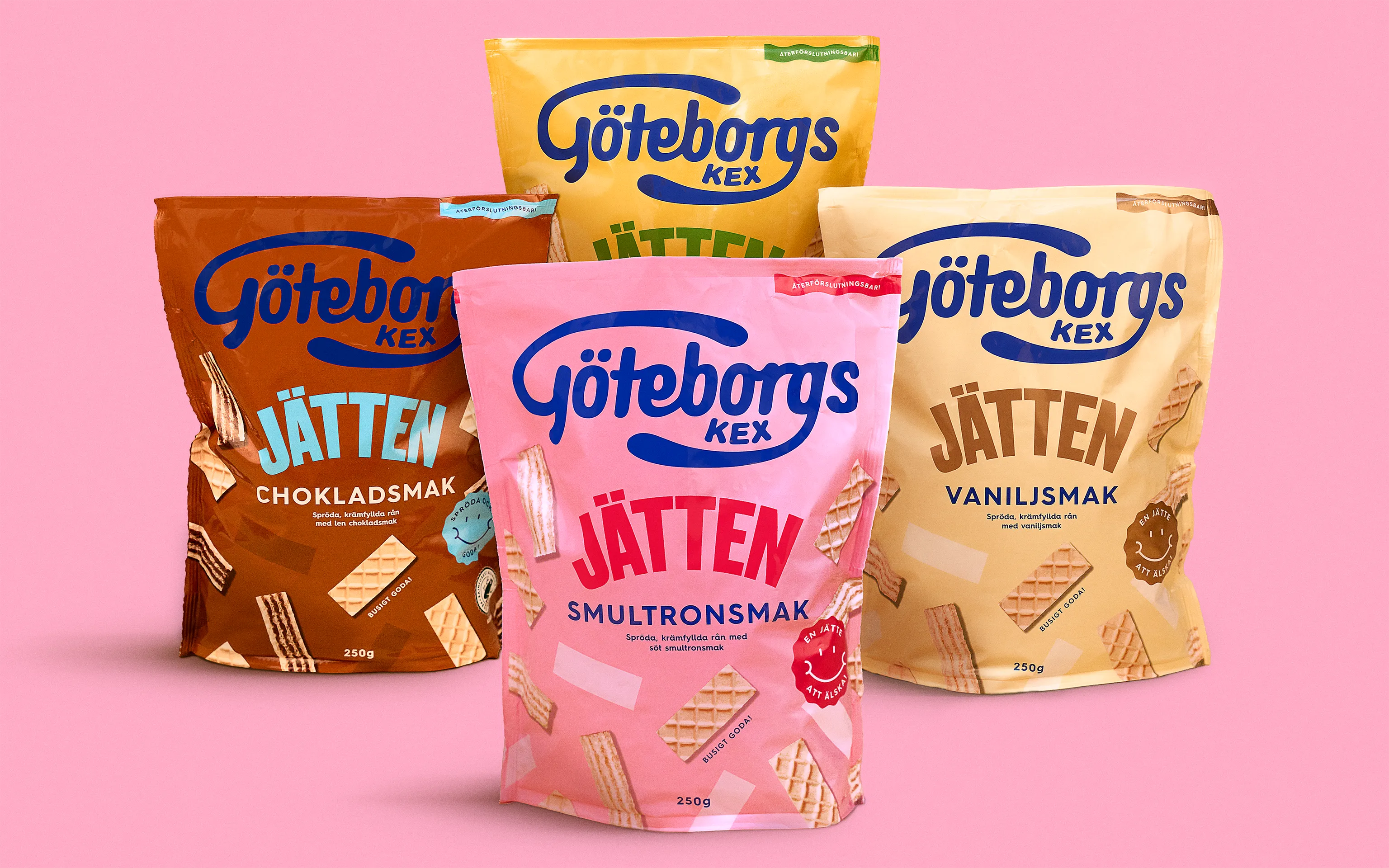
We created one distinctive expression that unifies every cookie under one brand, while still giving each product the space to be it’s own character. The logotype finally got the space it deserves, bold and proud. Each cookie was brought to the center of attention, encouraged to share their colourful stories: how they’re baked, crafted and enjoyed every day. The new identity celebrates the joy and playfulness at the heart of Göteborgs kex, making every fika moment feel just a little more magical.
What we did
Brand platform - We set the direction for the brand in a brand platform and positioning it as the proud yet humble category captain.
Brand architecture - As the product portfolio had grown organically over time, there was a need to clarify the architecture. We defined which cookies should live directly under Göteborgs Kex as part of the core brand, and which should continue to exist as strong, independent sub-brands.
Logo refresh – Confined to a small oval, the wordmark had gradually lost prominence. Distinctiveness lived in the blue shape rather than the name, while the cookie concepts became the primary memory cue. The refresh restored hierarchy by giving the wordmark the space to lead again.
Brand system – We built a visual identity designed to connect the brand seamlessly across all channels, from packaging and shelf to digital. Blue was identified as a core brand asset, creating a strong memory link between pack and communication and strengthening recognition across touchpoints.
Packaging system – We evolved the full cookie assortment, including all 13 original icons and their flavour variants. The balance was to bring the range closer together as one brand, while still preserving clear recognition and character within each cookie sub-brand.


